
YouTube Thumbnail Image: The Complete Guide to Creating High-Quality Thumbnails (2026)
Every successful YouTube video begins with a strong first impression, and that impression is often created by its YouTube Thumbnail Image. Before viewers read a title or decide whether a video is worth watching, they usually notice the thumbnail. A visually appealing and relevant thumbnail can encourage people to click, while a poorly designed one may cause them to scroll past your content. A YouTube Thumbnail Image is the preview image displayed alongside your video across YouTube Search, the Home feed, Suggested Videos, Subscriptions, and other browsing sections.
What Is a YouTube Thumbnail Image?
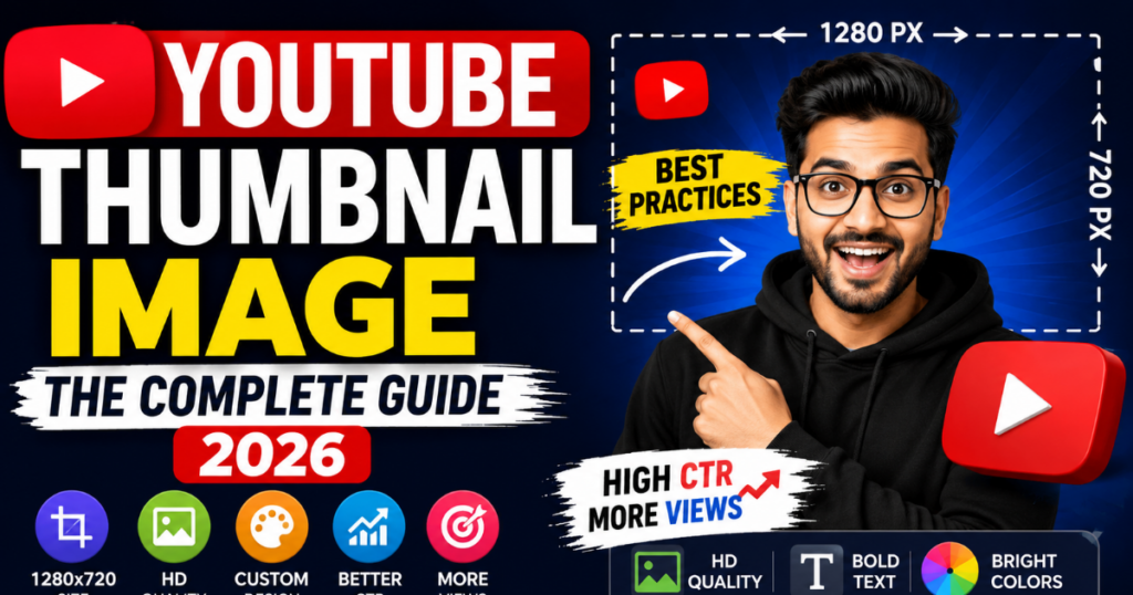
A YouTube Thumbnail Image is the preview image displayed before a viewer starts watching a YouTube video. It serves as the visual representation of the content and gives potential viewers an instant idea of what the video is about. Think of a thumbnail as the cover of a book or the poster for a movie. Just as an attractive book cover encourages someone to read further, an engaging thumbnail encourages users to click and explore your video.
Why YouTube Thumbnail Images Matter
A well-designed YouTube Thumbnail Image is one of the most valuable visual elements of any YouTube video. While great content keeps viewers watching, the thumbnail often determines whether someone clicks the video in the first place. In today’s competitive YouTube environment, where thousands of new videos are uploaded every hour, an effective thumbnail helps your content stand out without relying on misleading tactics.
Let’s explore why thumbnail images are so important.
1. They Create a Strong First Impression
First impressions matter in every form of digital content.
Before reading a video’s title or description, most users notice the thumbnail. Within a few seconds, they decide whether the video appears interesting, useful, or relevant.
A professional thumbnail can immediately communicate:
- The video’s topic
- Overall quality
- Target audience
- Style of content
Clear images, readable text, and balanced colors help establish credibility from the very beginning.
2. They Improve Brand Recognition
Consistent thumbnail design strengthens your channel’s visual identity.
Many successful YouTube creators use the same:
- Color palette
- Typography
- Logo placement
- Design style
- Layout
This consistency helps returning viewers recognize their videos while browsing YouTube.
For example, if every thumbnail uses similar branding elements, subscribers can quickly identify your content without reading the title.
3. They Can Improve Click-Through Rate (CTR)
Click-Through Rate (CTR) measures how often viewers click a video after seeing it.
Although many factors influence CTR, the thumbnail is one of the most noticeable.
A thumbnail that is:
- Clear
- Relevant
- High quality
- Easy to understand
is generally more likely to attract attention than one that appears blurry or cluttered.
Keep in mind that improving CTR should never come at the expense of accuracy. Your thumbnail should always represent the actual content of the video.
4. They Support Viewer Engagement
Good thumbnails attract the right audience.
When viewers clearly understand what a video offers before clicking, they are more likely to:
- Watch longer
- Leave comments
- Like the video
- Share it
- Subscribe if they find value
Accurate thumbnails help set the right expectations, contributing to a better viewing experience.
5. They Give Videos a Professional Appearance
Professional thumbnails demonstrate that care has been taken in presenting the content.
Compared to automatically generated video frames, custom thumbnails allow creators to control:
- Composition
- Colors
- Typography
- Branding
- Visual hierarchy
Even simple improvements—such as better lighting, cleaner backgrounds, and readable text—can make a thumbnail look more polished.
Practical Example
Imagine two videos explaining the same topic:
Video A
- Low-quality screenshot
- Blurry image
- Small text
- No branding
Video B
- High-resolution image
- Clean layout
- Bold readable title
- Consistent branding
- Strong color contrast
Most viewers are naturally more likely to notice Video B because it communicates professionalism and clarity.
The goal is not to exaggerate or mislead but to present your content in a visually appealing and accurate way.
Official YouTube Thumbnail Image Specifications
Using the correct technical specifications ensures your thumbnail looks sharp and professional across desktop computers, tablets, smartphones, and smart TVs.
Below are YouTube’s recommended thumbnail specifications.
YouTube Thumbnail Specification Table
| Specification | Recommended Value |
|---|---|
| Recommended Size | 1280 × 720 pixels |
| Minimum Width | 640 pixels |
| Aspect Ratio | 16:9 |
| Maximum File Size | 2 MB |
| Supported Formats | JPG, PNG, GIF, BMP, WEBP |
| Recommended Resolution | HD (1280 × 720) |
Recommended Dimensions
The ideal thumbnail size is 1280 × 720 pixels.
This resolution provides enough detail for high-quality display while maintaining compatibility across all YouTube devices.
Designing at this size helps ensure your thumbnail remains crisp whether it appears in search results, on the homepage, or in suggested videos.
Minimum Width
YouTube recommends a minimum width of 640 pixels.
Images below this size may appear blurry or lose important details, especially on larger displays.
Whenever possible, design at the full recommended resolution instead of relying on the minimum requirement.
Aspect Ratio
The recommended aspect ratio is 16:9.
This widescreen format matches the layout used by most YouTube videos.
Using an incorrect aspect ratio may cause unwanted cropping or scaling, reducing the overall quality of your thumbnail.
Maximum File Size
Thumbnail images must remain below 2 MB.
If your file exceeds this limit, consider:
- Compressing the image
- Saving with optimized quality settings
- Removing unnecessary metadata
Maintaining a reasonable file size also helps with faster uploads and efficient storage.
How to Create a Professional YouTube Thumbnail Image
Creating a professional YouTube Thumbnail Image is about much more than adding bright colors or large text. An effective thumbnail communicates the value of your video within seconds while remaining clear, visually balanced, and relevant to the content.
Whether you’re a beginner or an experienced creator, following a structured design process can help you produce thumbnails that look professional and support a positive viewing experience.
Below is a practical step-by-step guide.
Step 1: Understand Your Video’s Main Message
Before opening any design software, identify the core purpose of your video.
Ask yourself:
- What problem does the video solve?
- What is the main takeaway?
- Who is the target audience?
- Which visual best represents the topic?
A clear message makes it easier to create a focused thumbnail.
Step 2: Choose a High-Quality Image
The image is the foundation of every thumbnail.
Use:
- High-resolution photographs
- Clear screenshots
- Original graphics
- Professional illustrations
Avoid:
- Pixelated images
- Blurry screenshots
- Low-quality downloads
- Over-compressed files
The better your original image, the better your final thumbnail will look.
Step 3: Use the Recommended Thumbnail Size
Always create your thumbnail at YouTube’s recommended dimensions:
- 1280 × 720 pixels
- 16:9 aspect ratio
- Maximum file size: 2 MB
Designing at the correct size helps maintain image quality across desktop computers, smartphones, tablets, and smart TVs.
Step 4: Create a Clear Visual Focus
Every thumbnail should have one primary subject.
This might be:
- A person
- A product
- A logo
- A chart
- An object
- A screenshot
Avoid placing multiple competing elements in one design.
When viewers understand the subject immediately, the thumbnail becomes easier to process.
Step 5: Add Short, Readable Text
Thumbnail text should complement the video title—not repeat it.
Keep text:
- Short
- Bold
- Easy to read
Aim for approximately 3–6 words whenever possible.
Examples:
- Beginner Guide
- Step-by-Step Tutorial
- Easy Fix
- Best Settings
- Complete Guide
Use large font sizes so the text remains readable on mobile devices.
Step 6: Choose High-Contrast Colors
Strong contrast improves visibility.
Popular combinations include:
- Yellow + Blue
- Black + White
- Red + White
- Yellow + Black
- White + Dark Blue
Avoid placing similar colors together because they reduce readability.
Good contrast helps viewers recognize important information quickly.
Step 7: Organize Elements Using Visual Hierarchy
Visual hierarchy guides the viewer’s eyes.
A simple layout often works best:
- Main image
- Short headline
- Supporting graphic
- Brand element
Spacing between elements makes the design appear cleaner and more professional.
Step 8: Maintain Consistent Branding
If you regularly upload videos, use a consistent design style.
Maintain:
- Similar fonts
- Brand colors
- Logo placement
- Layout style
- Graphic style
Consistency helps viewers recognize your content while browsing YouTube.
Step 9: Preview on Mobile Devices
Most YouTube views come from mobile users.
Before publishing, reduce your thumbnail size and check:
- Is the text still readable?
- Does the subject remain clear?
- Are important details visible?
If not, simplify the design.
Step 10: Export Using the Best Format
Before uploading:
- Export in PNG, JPG, or WEBP.
- Keep the file below 2 MB.
- Review the final image at full size.
- Ensure colors appear natural.
- Check for spelling mistakes.
Taking a few extra minutes before publishing can prevent avoidable design issues.
Best Practices for YouTube Thumbnail Images
Professional thumbnails are built on proven design principles rather than trends alone.
The following best practices can help you create attractive, user-friendly thumbnails that support your channel’s long-term growth.
Use High-Quality Images
Always begin with the highest-quality image available.
A sharp, well-lit image appears more professional than a heavily edited low-resolution picture.
Good lighting and clear subjects make thumbnails easier to understand at a glance.
Keep the Design Simple
Simple designs are often more effective than complex ones.
Avoid adding unnecessary:
- Icons
- Shapes
- Stickers
- Decorative elements
- Large amounts of text
A clean layout helps viewers focus on the most important information.
Apply Strong Color Contrast
Color plays an important role in attracting attention.
Instead of using many bright colors together, select two or three complementary colors.
High contrast improves readability while creating visual impact.
Understanding Color Psychology
Different colors create different emotional responses.
Although there are no guaranteed outcomes, thoughtful color choices can influence how your thumbnail feels.
| Color | Common Association |
|---|---|
| Yellow | Energy, attention, optimism |
| Blue | Trust, professionalism, reliability |
| Red | Urgency, excitement, action |
| Green | Growth, success, learning |
| Black | Strength, sophistication |
| White | Simplicity, clarity |
Choose colors that match both your video’s topic and your overall channel branding.
Choose Readable Typography
Typography should improve communication—not distract from it.
Good thumbnail fonts are:
- Bold
- Clean
- Sans-serif
- Easy to read
Avoid:
- Thin fonts
- Decorative scripts
- Extremely small text
Use one or two fonts consistently throughout your channel.
Leave White Space
White space is the empty area surrounding design elements.
It helps:
- Improve readability
- Reduce clutter
- Create balance
- Highlight important information
Not every part of the thumbnail needs to be filled.
Leaving breathing room often creates a more professional appearance.
Use Authentic Facial Expressions
If your thumbnail includes people, natural facial expressions can help communicate emotion.
Expressions such as:
- Surprise
- Happiness
- Curiosity
- Concentration
- Excitement
can reinforce the topic of the video.
However, avoid exaggerated expressions that do not accurately represent the content.
Authenticity helps build long-term trust with viewers.
Prioritize Mobile Optimization
Because many viewers watch YouTube on smartphones, always design with small screens in mind.
Your thumbnail should remain effective when displayed at a reduced size.
Before publishing, ask yourself:
- Is the headline readable?
- Is the main subject clear?
- Are unnecessary details removed?
If the answer is yes, your thumbnail is more likely to perform well across different devices.
Maintain Consistent Branding
Consistency builds familiarity over time.
Try using the same:
- Primary colors
- Font family
- Thumbnail layout
- Logo position
- Graphic style
This helps viewers quickly recognize your videos and creates a cohesive channel identity.
Actionable Design Examples
The following examples demonstrate how thoughtful design choices can improve thumbnail quality.
Example 1: Tutorial Video
Topic: How to Edit YouTube Videos
Effective Thumbnail:
- Person using editing software
- Large text: “Edit Like a Pro”
- Blue background
- Yellow highlight
- Minimal icons
Example 2: Product Review
Topic: Best Budget Microphone
Effective Thumbnail:
- High-quality microphone photo
- Clear comparison badge
- Bold product name
- Simple background
- Consistent brand colors
Example 3: Educational Content
Topic: Learn YouTube SEO
Effective Thumbnail:
- Clean graph or analytics image
- Short headline
- Professional blue-and-white color scheme
- Minimal distractions
These examples illustrate an important principle: effective thumbnails communicate the video’s topic quickly without overwhelming the viewer. Simplicity, clarity, and consistency usually outperform cluttered or misleading designs.
Key Takeaways
Before publishing your next video, remember these best practices:
- Use high-resolution images.
- Design at 1280 × 720 pixels.
- Limit text to a few impactful words.
- Choose bold, readable fonts.
- Apply strong color contrast.
- Leave enough white space.
- Optimize for mobile viewing.
- Keep branding consistent.
- Export in a supported image format.
- Ensure the thumbnail accurately represents your content.
Following these guidelines will help you create thumbnail images that are visually appealing, user-friendly, and aligned with professional design standards.
Up Next (Part 4):
- Common Thumbnail Image Mistakes to Avoid
- How Thumbnail Images Affect YouTube CTR
- How Thumbnail Images Support YouTube SEO
- How to Download Public YouTube Thumbnail Images
- Practical Optimization Tips
Common Thumbnail Image Mistakes to Avoid
Even experienced creators sometimes make thumbnail design mistakes that reduce clarity or make videos less appealing to viewers. A well-designed YouTube Thumbnail Image should accurately represent your content while remaining easy to understand on all devices. Avoiding the following common issues can help improve the overall quality of your thumbnails.
1. Using the Wrong Thumbnail Dimensions
One of the most common mistakes is creating thumbnails with incorrect dimensions. Images that are too small or use the wrong aspect ratio may appear stretched, cropped, or blurry after uploading.
Solution:
- Design at 1280 × 720 pixels
- Use a 16:9 aspect ratio
- Keep the file size under 2 MB
2. Uploading Low-Resolution Images
A blurry thumbnail can make even valuable content look unprofessional.
Low-quality images often result from:
- Heavy compression
- Small screenshots
- Poor lighting
- Excessive editing
Solution:
Always start with a high-resolution image and export it using appropriate quality settings.
3. Adding Too Much Text
A thumbnail is not a poster.
Long sentences become unreadable on mobile devices.
Instead of this:
Learn Everything About Creating Professional YouTube Thumbnails
Use:
Complete Guide
or
Thumbnail Tips
Keep text short, clear, and impactful.
4. Creating Misleading Thumbnails
Clickbait thumbnails may generate curiosity initially, but they can disappoint viewers if they don’t accurately represent the video.
Examples include:
- Showing something not discussed in the video
- Exaggerated claims
- Edited images that misrepresent the content
Solution:
Create thumbnails that accurately reflect what viewers will see after clicking.
5. Poor Color Contrast
Text can become difficult to read when similar colors are placed together.
Examples:
- Yellow text on a white background
- Blue text on a black background
Solution:
Use strong contrast, such as:
- White on dark blue
- Yellow on black
- Black on yellow
This improves readability across different screen sizes.
6. Cluttered Layout
Adding too many icons, shapes, stickers, and text blocks can overwhelm viewers.
A crowded thumbnail makes it harder to identify the main subject.
Solution:
Focus on one primary subject, one short headline, and a clean layout.
7. Ignoring Mobile Users
Many viewers watch YouTube on smartphones, where thumbnails appear much smaller.
Small text and fine details may become unreadable.
Solution:
Preview your thumbnail at a reduced size before publishing to ensure important elements remain visible.
8. Inconsistent Branding
Changing colors, fonts, and layouts for every upload can make your channel look inconsistent.
Solution:
Maintain a consistent visual style using:
- Similar colors
- Font families
- Logo placement
- Design structure
Consistency helps build recognition over time.
How Thumbnail Images Affect YouTube CTR
Click-Through Rate (CTR) measures the percentage of people who click your video after seeing its thumbnail and title.
For example:
- Your thumbnail is shown to 1,000 people.
- 80 viewers click the video.
Your CTR would be 8%.
While content quality determines whether viewers stay engaged, the thumbnail plays an important role in encouraging that initial click.
Why CTR Matters
A higher CTR generally indicates that viewers find your video’s presentation relevant and appealing.
A well-designed thumbnail can help by:
- Attracting attention in search results
- Clearly communicating the topic
- Matching viewer expectations
- Encouraging qualified clicks
Remember that CTR should always be considered alongside viewer satisfaction and watch time. A thumbnail that attracts clicks but misrepresents the content may reduce trust over time.
Viewer Psychology and Thumbnails
People make quick decisions while browsing YouTube.
They often notice:
- Faces
- Bold colors
- Clear text
- Familiar branding
- Recognizable objects
A simple, visually organized thumbnail is easier to understand than one filled with unnecessary details.
Thumbnails and Watch Time
An accurate thumbnail helps attract viewers who are genuinely interested in the video’s topic.
When expectations match the content:
- Viewers are more likely to continue watching.
- Audience satisfaction may improve.
- Engagement often becomes more meaningful.
How Thumbnail Images Support YouTube SEO
Although thumbnails are not a direct ranking factor, they contribute to several user experience signals that are important for YouTube.
Better User Experience
Clear thumbnails help viewers understand the content before clicking.
This reduces confusion and improves the overall browsing experience.
Stronger Branding
Consistent thumbnails make it easier for returning viewers to recognize your videos.
Strong branding also creates a more professional channel appearance.
Improved Engagement
Well-designed thumbnails may encourage:
- More clicks from interested viewers
- Longer viewing sessions
- More comments
- Additional shares
- Increased subscriptions when paired with valuable content
Supporting Search Visibility
YouTube aims to recommend videos that satisfy viewers.
When youtube thumbnail image accurately represent the content and viewers respond positively, your videos are better positioned to compete within search results and recommendations.
The most sustainable strategy is to combine:
- High-quality thumbnails
- Valuable content
- Clear titles
- Helpful descriptions
- Relevant keywords
How to Download Public YouTube Thumbnail Images
Many creators, designers, and marketers study publicly available youtube thumbnail image to understand design trends and learn from successful examples.
Public thumbnails are visible on YouTube and can be viewed in different resolutions.
Common quality options include:
- Default Thumbnail
- Medium Quality
- High Quality
- Standard Definition
- High Definition (HD)
Studying public thumbnails can help you analyze:
- Color combinations
- Typography
- Layouts
- Branding styles
- Visual hierarchy
If you need to view publicly available thumbnail images for educational purposes, you can use YTThumbsPro’s YouTube Thumbnail Downloader to access available thumbnail resolutions for analysis and inspiration. The tool is intended to help users study publicly visible thumbnail images rather than encourage copying or misuse.
Practical Thumbnail Optimization Tips
Before publishing your next YouTube video, review this checklist:
- ✔ Use the recommended 1280 × 720 px dimensions.
- ✔ Keep the aspect ratio at 16:9.
- ✔ Use a high-resolution source image.
- ✔ Limit thumbnail text to a few impactful words.
- ✔ Choose bold, easy-to-read fonts.
- ✔ Apply strong color contrast.
- ✔ Maintain consistent branding.
- ✔ Preview the thumbnail on mobile devices.
- ✔ Export in JPG, PNG, or WEBP format.
- ✔ Ensure the thumbnail accurately represents the video content.
- ✔ Check for spelling or design errors before uploading.
- ✔ Keep the file size below 2 MB.
Following these practices helps create professional thumbnail images that are visually appealing, easy to understand, and aligned with YouTube’s recommended guidelines.