
Thumbnail Guides: The Complete Guide to Designing High-Performing YouTube Thumbnails (2026)
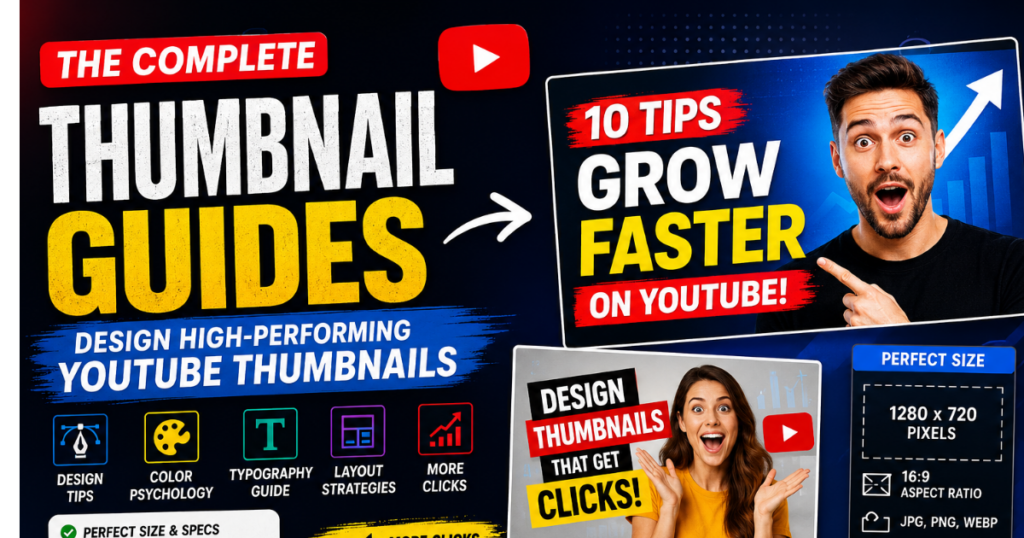
Every successful YouTube video starts with a single decision from the viewer: Should I click this video or not? In most cases, that decision is influenced by two things—the video title and its thumbnail. While the title explains the topic, the thumbnail creates the first visual impression. A compelling thumbnail can attract attention within seconds, making it one of the most valuable assets for any YouTube creator. This is where thumbnail guides become essential. Rather than relying on guesswork or copying popular designs, thumbnail guides provide practical principles for creating images that are visually appealing, easy to understand, and aligned with your video’s content. They help creators learn how to combine colors, typography, composition, and branding into thumbnails that communicate value without using misleading tactics.
What Are Thumbnail Guides?
Thumbnail Guides are structured recommendations, design principles, and best practices that help creators produce effective thumbnail images for YouTube and other video platforms. Instead of focusing only on visual appearance, these guides explain how to design thumbnails that are clear, consistent, and easy for viewers to understand at a glance. A good thumbnail guides combines technical requirements—such as image dimensions and file formats—with creative elements like typography, color contrast, spacing, and visual hierarchy. The goal is not simply to create attractive graphics but to communicate the purpose of a video quickly and accurately.
Why Every Creator Should Learn Thumbnail Design
Whether you publish videos every day or only occasionally, thumbnail design is an important skill.
Creators who understand thumbnail principles can:
- Present their videos more professionally
- Build a recognizable visual identity
- Improve consistency across their channel
- Communicate video topics more effectively
- Save time during the content creation process
You don’t need to be a professional graphic designer. Learning a few fundamental design principles can significantly improve the overall quality of your thumbnails.
How Thumbnail Guides Support YouTube Growth
Thumbnail guides contribute to long-term channel growth by helping creators develop a consistent visual style. When viewers repeatedly see well-designed thumbnails that accurately represent the content, they begin to recognize and trust the channel.
Well-planned thumbnails can support:
- Better first impressions
- Stronger brand recognition
- Improved content presentation
- Easier topic identification
- Higher viewer confidence before clicking
It’s important to remember that thumbnails should always work alongside valuable content. A strong thumbnail may encourage a viewer to click, but high-quality videos are what keep audiences engaged and encourage them to return.
Key Components Covered in Thumbnail Guides
A comprehensive thumbnail guide typically explains:
- Recommended YouTube thumbnail size
- HD image resolution
- Aspect ratio and file formats
- Typography and font selection
- Color psychology
- Thumbnail composition
- Visual hierarchy
- Branding techniques
- Mobile-friendly design
- Accessibility considerations
- Export settings
- Quality optimization
Understanding these elements helps creators design thumbnails that are both visually appealing and practical across different viewing environments.
Who Can Benefit from Thumbnail Guides?
Thumbnail guides are valuable for a wide range of users, including:
- YouTube Creators looking to improve the visual quality of their videos.
- Beginners learning the fundamentals of thumbnail design.
- Bloggers embedding YouTube videos into their websites.
- Graphic Designers creating thumbnails for clients.
- Businesses promoting products or services through video content.
- Digital Marketers optimizing campaigns for better engagement.
- Students and Educators producing educational video content.
- Content Agencies managing multiple YouTube channels.
Regardless of experience level, understanding thumbnail design principles helps create visuals that are more informative, recognizable, and viewer-friendly.
Why Thumbnail Guides Matter in 2026
The expectations of online audiences continue to evolve. Today’s viewers scroll through hundreds of pieces of content every day, making it essential for thumbnails to communicate information quickly and clearly.
Modern thumbnail guides focus on:
- Mobile-first design
- Cleaner layouts
- Readable typography
- Consistent branding
- Accessibility
- Authentic visual storytelling
Instead of relying on exaggerated graphics or clickbait, effective thumbnails prioritize relevance, clarity, and trust—qualities that contribute to a better overall viewing experience
Why Good Thumbnails Matter
A thumbnail is more than just a cover image—it is the visual gateway to your video. Before viewers decide to invest their time in watching your content, they evaluate what they see on the screen. A thoughtfully designed thumbnail communicates professionalism, sets expectations, and helps viewers quickly determine whether the video is relevant to their interests.
In today’s highly competitive YouTube ecosystem, where thousands of new videos are published every minute, a quality thumbnail can help your content stand out without relying on exaggerated or misleading visuals.
1. Thumbnails Shape the First Impression
People naturally process images faster than text. When users browse YouTube, they often notice the thumbnail before reading the title.
A strong thumbnail should instantly answer questions like:
- What is this video about?
- Who is it for?
- Why should I watch it?
For example, a cooking tutorial can highlight the finished dish, while a technology review might feature the product with a clean background. The objective is to communicate the video’s topic within a few seconds.
2. They Strengthen Your Channel Identity
A recognizable thumbnail style helps build a memorable brand.
Many successful creators use consistent elements such as:
- A fixed color palette
- Similar font styles
- Consistent logo placement
- Repeating layout patterns
- Matching visual themes
This consistency allows regular viewers to recognize your content while scrolling through search results or recommendations.
3. They Improve Content Discoverability
Although thumbnails are not direct ranking factors, they influence how viewers interact with your videos.
An informative and visually clear thumbnail can:
- Encourage more people to notice your video
- Help users identify the topic quickly
- Reduce confusion about the content
- Support a better browsing experience
When thumbnails accurately reflect the video, viewers are more likely to click because they understand what to expect.
4. They Help Build Viewer Trust
Trust is essential for long-term growth on YouTube.
A thumbnail should always represent the actual content of the video. If the visual promises something that the video doesn’t deliver, viewers may leave quickly or lose confidence in your channel.
To build trust:
- Use authentic images.
- Avoid misleading text.
- Match the thumbnail to the title.
- Represent the video’s main topic honestly.
Consistency between the thumbnail and the content creates a better experience for your audience.
5. They Improve Mobile Viewing
Most YouTube users watch videos on mobile devices.
This means your thumbnail must remain effective even at a much smaller size.
For mobile-friendly thumbnails:
- Use large, bold text.
- Focus on one main subject.
- Avoid excessive details.
- Leave enough spacing between elements.
Always preview your design on a smartphone before uploading.
6. They Support Professional Presentation
A professionally designed thumbnail reflects the effort invested in the video itself.
Simple improvements such as:
- Better lighting
- Clean composition
- Balanced colors
- High-resolution images
- Organized typography
can make your content appear more polished and credible.
Practical Example
Imagine two creators publish tutorials about the same topic.
Thumbnail A
- Crowded layout
- Tiny unreadable text
- Low-quality screenshot
- Random colors
Thumbnail B
- Clean composition
- High-resolution image
- Bold headline
- Consistent branding
- Balanced spacing
Most viewers are likely to understand Thumbnail B more quickly because it communicates the topic clearly without unnecessary distractions.
Essential Elements of a Great Thumbnail
Creating a successful YouTube thumbnail is not about adding random graphics or bright colors. An effective thumbnail combines visual design principles with clear communication. Every element should work together to help viewers understand the video’s purpose within a few seconds.
Below are the key components that make a thumbnail both attractive and functional.
1. A Clear Focal Point
Every thumbnail should have one main subject that immediately captures attention.
Your focal point might be:
- A person’s face
- A product
- A laptop or smartphone
- A chart or graph
- A finished project
- An important object related to the video
Avoid placing multiple competing subjects in one thumbnail. Too many focal points can make the design confusing.
Tip: If viewers can’t identify the main subject instantly, simplify the layout.
2. Readable Typography
Text should support the image, not overwhelm it.
Choose fonts that remain easy to read even on smaller mobile screens.
Best Practices
- Use bold fonts
- Limit text to 3–6 words
- Avoid decorative fonts
- Maintain consistent font styles
- Use proper spacing between letters
Good Example
YouTube SEO Tips
Poor Example
Complete Professional Guide About Everything You Should Know
The shorter and more direct your message, the more effective it becomes.
3. Strong Color Contrast
Contrast helps important elements stand out.
Examples of effective combinations include:
- White on Dark Blue
- Yellow on Black
- Black on White
- Red with White Accents
- Orange with Navy Blue
Avoid using similar shades for text and backgrounds, as they reduce readability.
4. High-Quality Images
The quality of your source image directly affects the final thumbnail.
Use images that are:
- Sharp
- Well-lit
- High resolution
- Properly focused
- Free from excessive compression
Whenever possible, use original photos or licensed assets rather than low-quality screenshots.
5. Balanced White Space
White space (or negative space) refers to the empty areas around objects and text.
It helps:
- Improve readability
- Separate important elements
- Reduce visual clutter
- Guide the viewer’s attention
A clean design often appears more professional than one filled with unnecessary graphics.
6. Consistent Branding
Brand consistency helps viewers recognize your videos more easily.
You can maintain consistency by using:
- The same color palette
- A recognizable font
- Similar layouts
- Logo placement
- Repeating design elements
This creates a cohesive visual identity across your channel.
7. Visual Hierarchy
Visual hierarchy determines the order in which viewers notice elements.
A typical hierarchy might be:
- Main image
- Headline text
- Supporting graphic
- Brand logo
Arranging elements by importance makes thumbnails easier to understand.
Best Thumbnail Design Principles
Understanding design principles helps creators build thumbnails that remain effective across different topics and audiences.
Color Psychology
Colors influence how viewers perceive your content.
Common color associations include:
| Color | Common Association |
|---|---|
| Red | Energy, urgency |
| Blue | Trust, knowledge |
| Yellow | Optimism, attention |
| Green | Growth, success |
| Orange | Creativity, excitement |
| Black | Premium, authority |
| White | Simplicity, clarity |
Rather than using many colors, select two or three complementary colors to maintain a clean design.
Typography Selection
Fonts communicate personality as well as information.
When selecting typography:
- Prioritize readability.
- Use one or two font families.
- Maintain consistent sizes.
- Avoid excessive effects.
Bold sans-serif fonts often perform well because they remain readable at smaller sizes.
Thumbnail Composition
Composition refers to how visual elements are arranged.
A balanced composition should:
- Lead the viewer’s eye naturally
- Keep the main subject prominent
- Avoid unnecessary distractions
- Maintain visual balance
Position key elements so they remain visible even when YouTube overlays timestamps or interface elements.
Applying the Rule of Thirds
The Rule of Thirds divides an image into nine equal sections using two horizontal and two vertical lines.
Instead of placing every element in the center, position important subjects near the intersection points. This often creates a more dynamic and visually appealing composition.
Background Selection
The background should support the main subject rather than compete with it.
Good backgrounds are:
- Simple
- Clean
- Slightly blurred when appropriate
- Relevant to the video’s topic
If the background contains many details, consider darkening or softening it so the foreground remains the focus.
Icons and Graphic Elements
Icons can reinforce your message when used thoughtfully.
Examples include:
- Play buttons
- Arrows
- Checkmarks
- Magnifying glasses
- Simple symbols related to the topic
Use icons sparingly. Too many graphic elements can make the thumbnail look cluttered.
Shadows and Outlines
Subtle visual effects improve separation between elements.
Consider adding:
- Light text shadows
- Thin outlines around text
- Soft drop shadows behind important objects
These effects enhance readability without overwhelming the design.
Designing for Mobile Users
A significant portion of YouTube traffic comes from smartphones.
To improve mobile readability:
- Use large text
- Keep layouts simple
- Focus on one subject
- Increase contrast
- Test your thumbnail at a smaller size before publishing
If viewers can understand your thumbnail on a phone screen, it will usually perform well on larger displays too.
Step-by-Step Guide to Designing a Thumbnail
Follow these practical steps to create a professional thumbnail from start to finish.
Step 1: Understand Your Video
Identify the video’s main topic and the key message you want viewers to notice immediately.
Step 2: Choose a High-Resolution Image
Select a clear image with good lighting and sharp details. Avoid blurry screenshots whenever possible.
Step 3: Set the Correct Canvas Size
Create a new design using 1280 × 720 pixels with a 16:9 aspect ratio.
Step 4: Define Your Focal Point
Decide what should attract attention first—a face, product, or important object—and make it the visual center of the design.
Step 5: Add a Short Headline
Write a concise phrase of three to six words that complements the image and highlights the video’s topic.
Step 6: Apply Your Brand Style
Use consistent fonts, colors, and layout patterns that match your channel’s visual identity.
Step 7: Improve Contrast
Adjust colors, brightness, and spacing so the text and main subject stand out clearly from the background.
Step 8: Review the Layout
Remove unnecessary elements and ensure there is enough white space to keep the design clean and balanced.
Step 9: Preview on Different Devices
Check how the thumbnail looks on both desktop and mobile screens. Make sure the text remains readable and the focal point is clear.
Step 10: Export and Save
Export the thumbnail in a supported format such as JPG, PNG, or WEBP, keeping the file size below 2 MB while preserving image quality.
By following these steps consistently, you can create thumbnails that are visually appealing, technically optimized, and aligned with your video’s content.
Common Thumbnail Design Mistakes (and How to Avoid Them)
Even experienced creators can lose potential viewers because of small design mistakes. A thumbnail doesn’t need to be complicated to be effective, but it does need to be clear, relevant, and technically correct. Below are some common issues that reduce thumbnail quality and practical ways to fix them.
1. Overloading the Thumbnail with Information
Trying to include every detail from your video in the thumbnail often creates confusion.
Common Problems
- Multiple headlines
- Too many images
- Excessive icons
- Busy backgrounds
Better Approach
Choose one clear message and one primary visual. If the viewer understands the topic within a second or two, the thumbnail is doing its job.
2. Using Inconsistent Branding
If every thumbnail looks completely different, returning viewers may not recognize your content.
Common Problems
- Different fonts in every video
- Random color combinations
- Changing layout styles
- No visual identity
Better Approach
Develop a simple design system for your channel.
Examples include:
- One headline font
- Two or three brand colors
- Consistent logo placement
- Similar composition
Over time, this creates familiarity without making every thumbnail identical.
3. Ignoring Mobile Users
Many thumbnails look excellent on a large monitor but become difficult to understand on a smartphone.
Common Problems
- Tiny text
- Small icons
- Thin fonts
- Overcrowded layouts
Better Approach
Before publishing, zoom out or preview the thumbnail at a small size. If the message is still easy to understand, your design is likely mobile-friendly.
4. Poor Image Selection
A weak source image limits the quality of the final thumbnail.
Common Problems
- Dark lighting
- Motion blur
- Pixelated screenshots
- Low-resolution downloads
Better Approach
Use original high-quality images whenever possible and adjust brightness, contrast, or sharpness before adding text.
5. Weak Visual Hierarchy
When every element competes for attention, viewers don’t know where to look.
Common Problems
- Equal-sized text and images
- No focal point
- Random placement
Better Approach
Guide the viewer naturally:
- Main subject
- Headline
- Supporting graphics
- Branding elements
This creates a logical reading flow.
6. Misleading Clickbait
An exaggerated thumbnail may attract curiosity, but if it doesn’t match the video’s content, viewers may leave quickly.
Better Approach
Create curiosity through design—not deception.
Your thumbnail should accurately represent:
- The topic
- The tone
- The value viewers can expect
Building trust is more valuable than chasing short-term clicks.
7. Poor Export Quality
A professionally designed thumbnail can still look unprofessional if exported incorrectly.
Before Uploading
✔ Export at 1280 × 720 pixels
✔ Keep the file size under 2 MB
✔ Use JPG, PNG, or WEBP
✔ Check image sharpness
✔ Review colors after export
Best Free Thumbnail Design Tools
You don’t need expensive software to create professional-looking thumbnails. Several free design tools provide templates, editing features, and export options suitable for beginners and experienced creators alike.
| Tool | Ease of Use | Templates | AI Features | Free Plan | Best For |
|---|---|---|---|---|---|
| Canva | Excellent | Extensive | Yes | Yes | Beginners & Fast Designs |
| Adobe Express | Excellent | Large Collection | Yes | Yes | Professional Marketing Graphics |
| Figma | Moderate | Community Templates | Limited | Yes | Collaborative UI & Custom Layouts |
| Photopea | Moderate | Manual Design | No | Yes | Photoshop-Like Editing |
| Pixlr | Easy | Basic Templates | Yes | Yes | Quick Image Editing |
How Thumbnail Guides Improve YouTube SEO
Although thumbnails are not a direct ranking signal, they contribute to a better overall user experience, which is an important part of successful content creation.
Improve Click-Through Opportunities
A clear thumbnail helps viewers quickly understand what the video offers.
When thumbnails communicate value effectively, users are more likely to consider watching the video.
Support Better User Experience
Good thumbnail design reduces confusion.
Viewers can easily identify:
- Topic
- Style
- Target audience
- Expected content
This creates a smoother browsing experience.
Strengthen Brand Recognition
Consistent thumbnail design makes your channel easier to recognize.
Strong branding includes:
- Repeating colors
- Consistent typography
- Similar layouts
- Familiar visual style
Encourage Audience Retention
Accurate thumbnails help attract viewers who are genuinely interested in your content.
Matching expectations with actual content can contribute to:
- Longer viewing sessions
- More meaningful engagement
- Increased subscriber confidence
Improve Long-Term Channel Growth
Rather than focusing only on individual videos, thumbnail guides encourage creators to build a consistent visual identity across their entire channel.
This long-term approach supports:
- Better organization
- Higher professionalism
- Improved audience recognition
- Sustainable growth
Quick Tips Checklist
Use this checklist before uploading every thumbnail.
✅ Design at 1280 × 720 pixels
✅ Maintain a 16:9 aspect ratio
✅ Keep the file size below 2 MB
✅ Use high-resolution source images
✅ Focus on one main subject
✅ Keep text between three and six words
✅ Use bold, readable fonts
✅ Maintain strong color contrast
✅ Leave enough white space
✅ Use consistent branding
✅ Avoid misleading visuals
✅ Keep backgrounds clean
✅ Align elements carefully
✅ Preview on desktop and mobile
✅ Use original or licensed images
✅ Limit the number of colors
✅ Position important elements away from YouTube’s timestamp
✅ Export in JPG, PNG, or WEBP format
✅ Double-check spelling and grammar
✅ Ensure the thumbnail matches the video title
✅ Test different design styles over time
✅ Review older thumbnails to identify improvements
✅ Stay consistent across your channel
✅ Keep accessibility in mind with readable fonts and contrast
✅ Prioritize clarity over unnecessary decoration
Frequently Asked Questions (FAQs)
1. What is a thumbnail guide?
A thumbnail guide is a collection of design principles, technical recommendations, and creative best practices that help creators build thumbnails that are visually appealing, easy to understand, and suitable for YouTube.
2. Why are thumbnails important for YouTube videos?
A thumbnail is usually the first visual element viewers notice. It helps communicate the video’s topic, improves presentation, and encourages users to learn more about your content.
3. What is the ideal YouTube thumbnail size?
The recommended thumbnail size is 1280 × 720 pixels with a 16:9 aspect ratio. This ensures good image quality across desktop, mobile, and TV screens.
4. Which file formats can I use for YouTube thumbnails?
YouTube supports:
- JPG
- PNG
- WEBP
- GIF
- BMP
Among these, JPG and PNG are the most commonly used because they provide a good balance between quality and compatibility.
5. How much text should a thumbnail contain?
A thumbnail should contain only the most important words. Short headlines are generally easier to read than long sentences, especially on mobile devices.
6. Do I need graphic design experience to create thumbnails?
No. Many creators start with simple layouts and improve over time. Understanding basic design principles is often more valuable than using advanced editing techniques.
7. What colors attract attention without being distracting?
Colors with strong contrast, such as blue and white, yellow and black, or red and white, can improve readability while maintaining a clean appearance. The key is balance rather than brightness alone.
8. How can I make my thumbnails consistent?
Use the same:
- Font family
- Color palette
- Logo placement
- Layout style
A consistent visual identity helps viewers recognize your videos more easily.
9. Is it okay to use screenshots from my videos?
Yes. High-quality screenshots can work well if they are sharp, well-lit, and clearly represent the video’s main topic. Custom-designed thumbnails may provide greater flexibility for branding.
10. How often should I redesign my thumbnails?
There is no fixed schedule. If your channel branding changes or older thumbnails no longer meet your quality standards, updating them may improve consistency across your content library.
11. What makes a thumbnail mobile-friendly?
Large text, a clear focal point, strong contrast, and a simple layout help ensure the thumbnail remains effective on smaller screens.
12. Can I study other creators’ thumbnails?
Yes. Observing publicly available thumbnails can help you understand composition, typography, and color choices. However, use them as inspiration and create your own original designs.
13. Why should I avoid cluttered thumbnails?
Too many elements compete for attention and make it difficult for viewers to understand the main message quickly.
14. What is visual hierarchy in thumbnail design?
Visual hierarchy is the arrangement of elements based on importance. It guides the viewer’s eye from the main subject to supporting details in a logical order.
15. Do thumbnails affect audience trust?
Yes. A thumbnail that accurately represents the video’s content helps build credibility and encourages long-term viewer confidence.
16. Can a thumbnail include a channel logo?
Yes. A small, consistently placed logo can reinforce branding without distracting from the main message.
17. Why should I preview my thumbnail before uploading?
Previewing allows you to check readability, spacing, and clarity on different screen sizes, reducing the chance of design issues after publishing.
18. What should I avoid when choosing fonts?
Avoid decorative or overly thin fonts that become difficult to read. Choose bold, clean typefaces that remain legible even when scaled down.
19. How do thumbnail guides help beginners?
Thumbnail guides provide practical recommendations that simplify design decisions, making it easier for beginners to create professional-looking thumbnails without extensive experience.
20. Can I use YTThumbsPro to learn from public thumbnails?
Yes. YTThumbsPro’s YouTube Thumbnail Downloader can be used to view publicly available thumbnail images for educational purposes, helping creators study layouts, color combinations, and design techniques while respecting copyright and intellectual property.
Final Thoughts
An effective thumbnail is not created by chance—it is the result of thoughtful planning, technical accuracy, and clear visual communication. Throughout this guide, we’ve explored how thumbnail design combines creativity with practical principles such as proper dimensions, readable typography, balanced colors, and organized layouts.
The most successful thumbnails are those that immediately communicate the video’s purpose without overwhelming the viewer. Instead of relying on excessive effects or exaggerated claims, focus on clarity, relevance, and consistency. A well-structured design helps your audience understand what your content offers before they even press play.
Most importantly, remember that a thumbnail should support—not replace—valuable content. When compelling visuals are paired with informative and engaging videos, you create a better overall experience for your audience and build stronger long-term trust.